
The Times Are A-Changin’

This article caught my eye in this morning’s newspaper and I want to tell you about it.
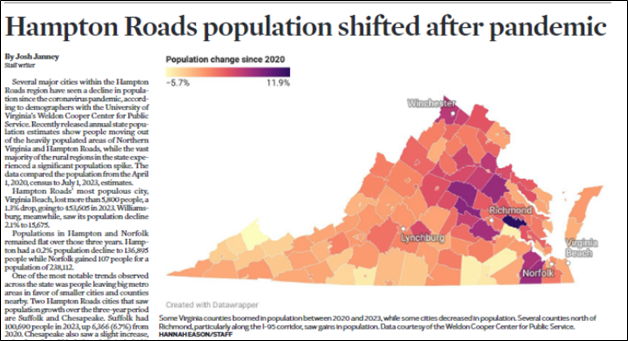
The headline summarizes the story very well – the COVID-19 pandemic impacted people’s decisions about where to live, redirecting established trends. The purple areas on the map above show the greatest population growth, reflecting a move away from major urban areas (and their suburbs) in favor of more rural areas. The shifting demand reflects two things: a desire for less congestion and lower housing prices along with a desire to maintain access to what cities have to offer.
You can see this change reflected in the areas along the I-95 Corridor, between Richmond (near the center of the map) and the Washington DC suburbs (on the top right of the map). Counties along that corridor (which includes expanded rail service over the past couple of years) are more popular because DC-based workers who no longer have to go into the office every day can find more affordable housing and less congestion in the previously rural areas.
The article offers a detailed analysis of who moved where, but I want to focus on the impacts of these moves. The major driver of this change is the explosion of remote work and remote schooling during the pandemic. The opportunity to work and go to school from wherever you happen to live spiked during the pandemic but has not gone away. Businesses have found that telework options for their employees increase worker satisfaction and decrease business overhead expenses, so that’s a win-win. There is a downside, of course; workers who don’t work side-by-side daily don’t develop the community connection that has been part of working with other people. I don’t think we understand yet what the long-range implications of this will be.
We have seen the impacts of these changes on major cities.

Economists are always aware of the multiplier effect of swings in the business environment – the economic changes that are the secondary impacts of big developments. It’s easy to understand these secondary effects – if large office buildings are housing fewer employees, the associated places to eat lunch or shop in the area near where you work will close as well. This means even fewer workers entering the central business sectors of the cities, leading to an even increased multiplier effect. And so forth.
This article focuses on the economic impacts of these patterns, but I want to talk for a minute about the political impacts. Historically, people who moved to the cities adapted to the urban environment, with its younger, more highly educated, and racially diverse population. This is what makes cities the stronghold of the Democratic Party, whose community-based policy positions make sense in an environment where people live close together and have to get around in a congested environment. Increased spending on public policy concerns like poverty, homelessness, crime, and infrastructure has been the bedrock Democratic Party platform for decades.
Meanwhile, rural areas have become the bedrock GOP constituency – older, less educated, and less diverse, more individualist less amenable to government solutions to problems. This imbalance has contributed to the current political divide in the country – urban voters outnumber rural voters, but gerrymandering and the Electoral College (really just a huge gerrymander) allow the GOP to win elections. So what happens when the urban voters move back to rural America? We have answers to this – just look at Georgia, where migrants from the industrial northeastern cities have turned the Atlanta area bright blue and have led the state to be identified as a “swing state” in national elections. Liberals who move to conservative areas don’t become conservatives – they are more likely to move the needle in the liberal direction for the areas they move to.
The migrants to rural America often bring big-city expectations with them, challenging the traditional ways of doing things in the previously sleepy rural towns and counties. I remember a conversation I had with our new neighbor, Heather, when we first moved to Williamsburg in 1998. She was standing in her driveway, waiting for an appliance delivery truck, at the same time that I was waiting for the moving van to arrive from Northern Virginia with all of our stuff. She was complaining about how long it took to get things done, and I (gently) reminded her that this more relaxed way of doing things was part of the price we both paid for moving from the more congested to less congested parts of Virginia. She (grudgingly) accepted this, and over the years that we were neighbors we both acclimated to the slower pace. As Williamsburg has continued to grow, however, the new residents – many of them retired folks moving from big cities to our small town – have continued to bring similar expectations with them. One result of this has been a shift in our local politics; James City County still votes fairly red, but there are blue inroads, and the City of Williamsburg is bluer than blue.
The article focuses on Isle of Wight County, a small rural county south of the James River in southeastern Virginia (what we call Southside). Its population grew by 5.9% between 2020 and 2023, toward the high end of county growth rates in the state. Now, we have to be aware that we’re talking about relatively small numbers here – Isle of Wight’s population is now just a hair below 40,000, which means that its population in 2020 was about 38,000 people. Its population grew by 2,000 in the period the study was looking at.
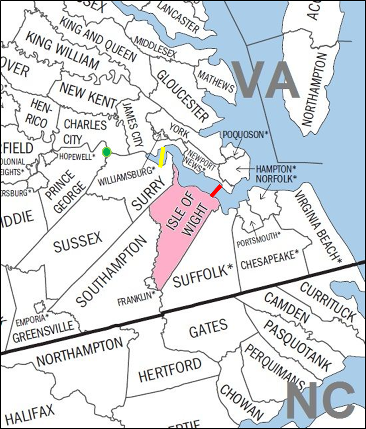
A look at this map will help you understand what’s going on here. First of all, Isle of Wight County is fairly close to several major population (and business) centers. Norfolk and Portsmouth, with its various United States Navy bases, are just a short drive away. The tourist (and thus commercially attractive) destination of Virginia Beach is nearby also. And there is a bridge connecting Isle of Wight to the cities of Newport News and Hampton on the Virginia Peninsula, where there are substantial businesses, including the Newport News Shipyard. The red line shows the rough location of the James River Bridge connecting Isle of Wight County to Newport News and other places on the Peninsula.
Another article in today’s paper tells us a little about another effort to facilitate crossing the James River – the yellow line on the map above is the current site of the James River Ferry.

A proposal to study the feasibility of a bridge to replace the ferry service between Surry and James City Counties died in this year’s session of the General Assembly.
The map shows you what this means. The green dot on the map shows the location of the Benjamin Harrison Bridge, about 35 miles inland from the ferry. The James River Bridge (red on the map) is about 35 miles southeast of the ferry. Although the ferry runs 24 hours a day and is free, it is not a very efficient way to cross the river, and the unavailability of any nearby options to get to Southside (which is the Virginia name for the area south of the James River) hinders economic develop in this area.
As you can imagine, people on each side of the river have reasons to either support or oppose the building of this bridge. The demographic changes I talked about in the first part of this article are going to change these discussions.
Yep; we see it, know it, and feel it every day. Important article.
My son, who is an IT guy, has worked at home for many years. Our daughter, who started working for Navy Credit Union in Pensacola, FL a couple of months ago as a person that answers NCU questions over the telephone, has finished her training and started working at home on Monday.