
Oh, The Places You'll Go

In Week Six of Amy Johnson Crow’s #52 Ancestors in 52 Weeks genealogy challenge, the topic was Maps. Here’s what I wrote for this challenge.
Location, location, location!
That’s the key to real estate, or so we’re told. But it’s also the key to genealogy.
There’s nothing like a good map to explain elements of your family’s history. The terrain explains why they build their homes where they did. The roads and waterways explain how they got from one place to another. Maps that show historical events explain how your ancestors were impacted by these events.
I know several websites whose maps have been valuable to me in my genealogy research, but my favorite is MAPOFUS https://mapofus.org
This site shows the evolution of state and county boundaries in the United States. Here’s an example of how this resource can be used:
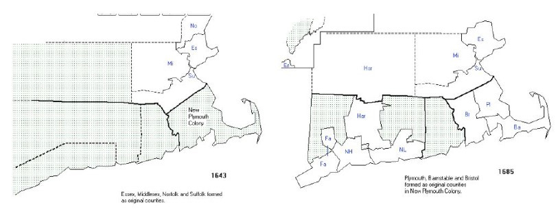
I did a project a couple of years ago in which I investigated the places where my ancestors lived. Through MAPOFUS, I figured out where to look for resources – my ancestors who lived in eastern Massachusetts were documented in the records of “New Plymouth Colony” until 1685, and then in either Barnstable, Bristol, or Plymouth Counties. These counties were further reconfigured over the years. Knowledge of this process helped me focus my research. I knew, for example, that two of my ancestors – my paternal 11th great-grandfather Edmond Freeman and my paternal 10th great-grandfather Thomas Dexter – were two of the Ten Men from Saugus (north of Boston) recognized as founders of Sandwich, Massachusetts, in Barnstable County. This was in 1639. Knowing that there was not an official entity called Barnstable County until 1685 helped me figure out where to find records of these families. I had to look in New Plymouth County – but not Plymouth County, which was another thing altogether.
I also use MyMaps a lot. This uses the Google Maps function, but allows the user to customize maps to list only the locations of interest. Here’s one of the MyMaps that I created:
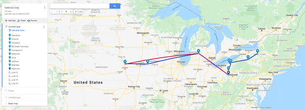
This map tracks where my 3rd great-grandmother Melinda Cody lived over the course of her life. I was trying to understand her life, and I was getting lost in the many moves she made. Putting these locations on a map helped me figure out what she was doing.
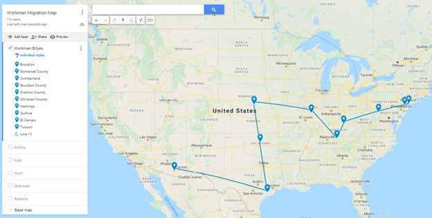
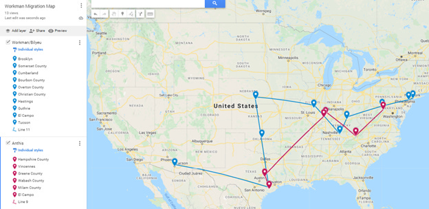
Here’s another map. This one shows the migration of my ancestors on my mother’s line (the Workman family) as they moved around the country over eight generations.
You can add layers to these maps; here’s the same map with an overlay of the Anthis family – my maternal grandmother’s maiden name was Anthis.
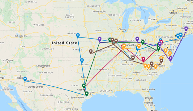
And so on. This is what the map looked like by the time I had added all the family lines in separate layers:It was too cumbersome to show the key from on the left side of the map – the seven layers extended too far below the bottom of the map. On the screen it’s possible to scroll down and see all the towns. It doesn’t work when you’re trying to print a hard copy of this.
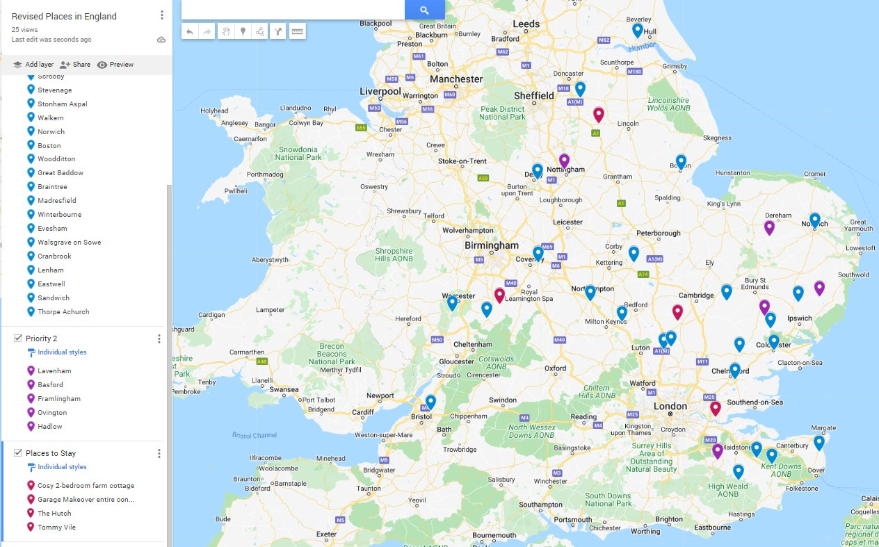
Need one more example? I’m planning a research trip to England later this year, and I’ve made a map that shows the towns and villages where my ancestors lived. The map on the left (below) shows the places where we’re staying (in red), the first priority villages we’re visiting (in blue), and the second priority villages we’re visiting (in purple).
Remarkable and pretty impressive.